
Streamlining Insurance Workflows with AI-Driven Commands
AgencyRoot is a platform for insurance professionals to manage clients, documents, and policies. It lets them send messages, organize files, search records, and add notes. However, completing any of those tasks required multiple clicks and navigating deep into the platform.The deeper problem showed up in our contextual inquiries. Users were on AgencyRoot, but they weren't using all of its features. Even when AgencyRoot had the feature they needed, users still reached for external tools. They just felt easier to use.
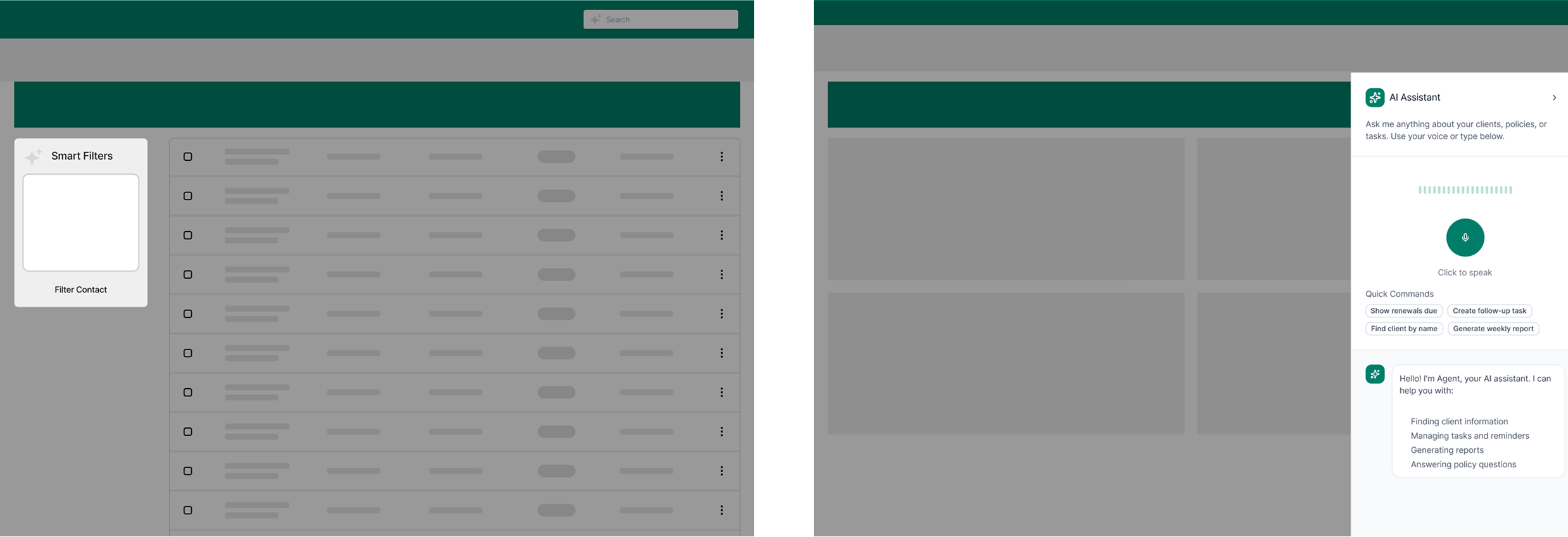
Our project sponsor asked us to design an AI feature. The team explored multiple concepts like a smart filter and an AI assistant, but neither of them worked.The smart filter forced users to stop and think of the right words to type, which could actually be slower than just using the existing filters. The AI assistant broke their workflow by pulling them into a separate interface, disconnecting them from what they were already doing. When we tested it, users also didn't trust AI-generated answers for insurance data. They needed to see the actual source themselves, not a summary.
When our explorations started getting scattered and the team couldn't align, I brought everyone back to the research. One thing kept appearing across all the interviews: every insurance professional had their own specific way of doing things. Trying to change their workflow wasn't the answer.
So I reframed the question: how might we design something that fits into how they already work, while still bringing them back to the platform?
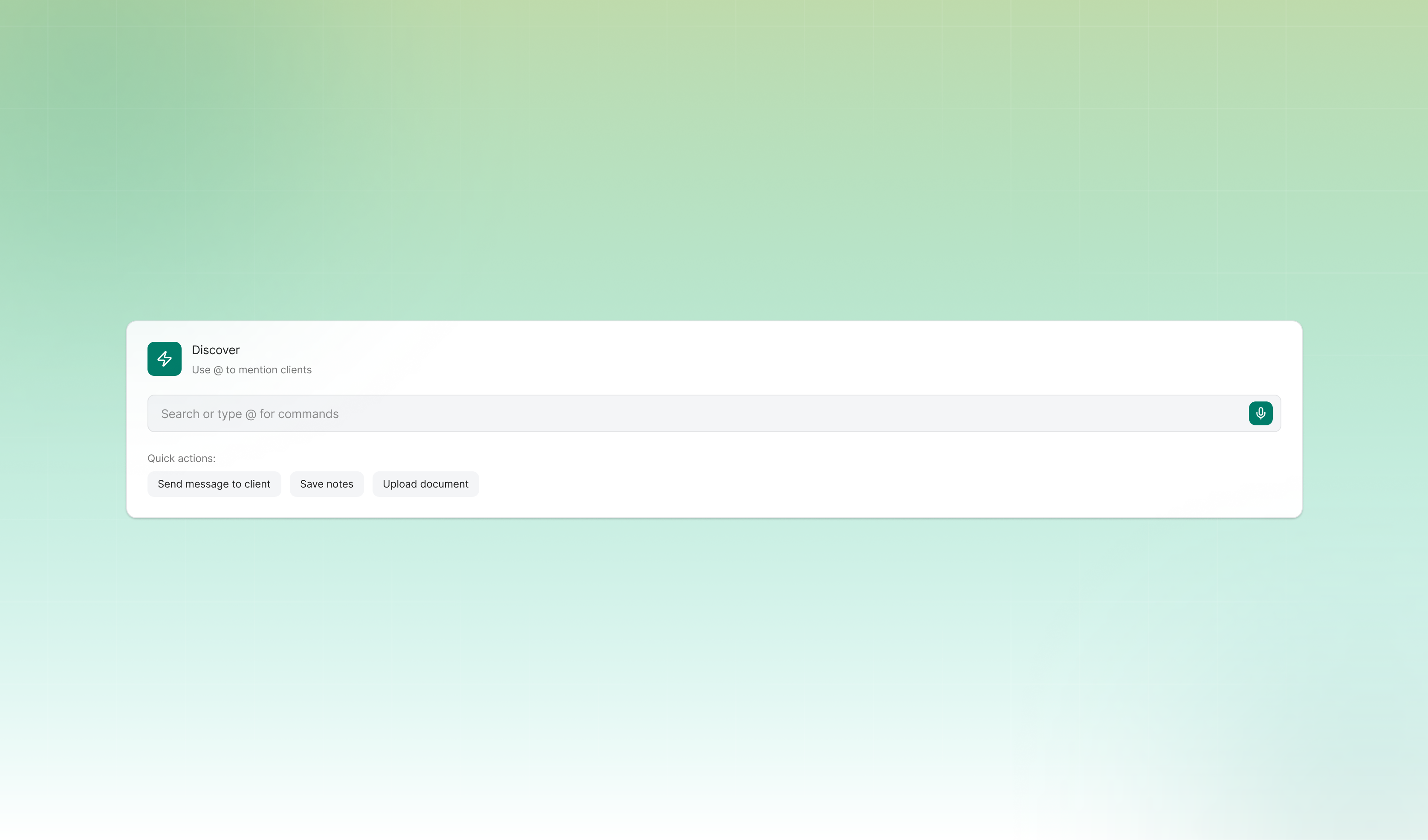
That question led me to propose the terminal concept. The team was skeptical at first because it felt unconventional, but the research clearly supported it, and I pushed for it.
The terminal lives beside the search bar on the navbar. It is always accessible on every page. No new surface to learn, no context switching. It is an upgrade to something users already use every day.
The interaction is fast and guided in three steps: type a client name and autocomplete shows matching results, select an action, then complete it. Users can send a message, upload a document, or look up a record, all in one place and in simple steps.
For document uploads, the AI reads the file and organizes it automatically into the right categories. I kept a manual confirmation step before anything is committed, because I knew from research that users needed to stay in control of their data and not just trust the AI to handle it.
After validating with users and the project sponsor, the most consistent feedback was: what about multiple clients at once? So I iterated to add batch actions. Instead of doing the same task one client at a time, users could now handle multiple clients at once.
The terminal reduced task completion time by 60% for the core features. More importantly, it gave users a reason to stay on the platform. And because the terminal is scalable, new actions can always be added as user needs grow.
This project taught me to go back to the research when things get complicated. When the team had too many ideas going in different directions, revisiting the user needs helped us cut through the noise and make a decision everyone could align on.This project also changed how I think about AI in design. The terminal uses AI to do the heavy lifting behind the scenes, but users never have to think about it. That shaped how I think about using AI as a design material, not just a feature to add on.